

Monthly ecommerce dashboard: 8,400 add-to-carts, 2,940 checkouts started, 1,176 completed purchases. Checkout completion rate: 40%. Abandonment cost at $85 average order value: $149,940 monthly revenue left on table.
Team analysis: "We have checkout abandonment problem."
Proposed solutions: Simplify layout. Add trust badges. Test different button colors. Remove optional fields. Add progress indicator showing steps remaining.
Six weeks later: Three checkout tests completed. Layout simplification showed 2% lift. Trust badge test inconclusive. Button color test decreased conversion 3%. Progress indicator test showed no statistical difference. Checkout completion unchanged at 41%.
The diagnostic gap: Team knows checkout abandons but not where, why, or which specific elements cause exits. "Checkout abandonment" describes symptom, not disease. Without identifying exact friction points, tests guess at fixes.
Analytics showing 60% checkout abandonment provides no actionable intelligence. Which step bleeds most traffic? Desktop or mobile? Which fields trigger hesitation? What error messages cause exits? Browser-specific bugs? Payment integration failures?
CRO analyzers answer these questions by diagnosing checkout friction at element level, revealing exactly which barriers prevent completion and enabling targeted fixes instead of random layout experiments.
"Data is a precious thing and will last longer than the systems themselves." — Tim Berners-Lee
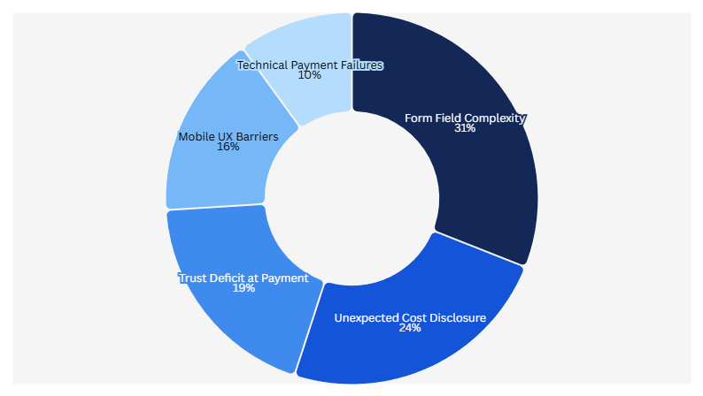
The Checkout Friction Categories Analytics Cannot Distinguish
Standard analytics measures checkout abandonment as aggregate metric. CRO analyzers categorize abandonment by friction type enabling specific fixes:
Friction Type 1: Form Field Complexity
Analytics shows: 45% abandon between cart and shipping information completion
Analyzer diagnosis: Checkout form contains 11 required fields (name, email, phone, company, address line 1, address line 2, city, state, ZIP, country, shipping preference)
Research demonstrates reducing form fields from 11 to 4 increases conversions by 120%. But which 7 fields can be removed safely? Analyzer identifies:
Required for order fulfillment: Name, address, city, state, ZIP (5 fields)
Optional, low value: Company name (B2C context), address line 2 (captures apartment numbers but could be combined), phone (order updates via email), country (if shipping US-only), shipping preference (could default to standard)
Analyzer recommendation: Reduce to 5 essential fields, increase checkout completion from 40% to potentially 48% based on form optimization research.
The specificity enables confident implementation. "Reduce form fields" stays vague; "Remove company, address line 2, phone, country, shipping preference fields" executes immediately.
Friction Type 2: Unexpected Cost Disclosure
Analytics shows: 28% abandon after viewing order total
Analyzer diagnosis: Shipping cost ($12.99) first disclosed at final checkout step, surprising users expecting free shipping or lower cost
Checkout sequence analysis:
Step 1 (Cart): Product subtotal $72.50, no shipping mentioned
Step 2 (Shipping info): Form fields, no cost preview
Step 3 (Order review): Subtotal $72.50 + Shipping $12.99 + Tax $6.23 = Total $91.72
Friction point: 27% cost increase from expected subtotal to final total, disclosed only at last step
Analyzer recommendation: Display shipping cost estimate at cart step OR offer free shipping threshold ("Add $17.50 more for free shipping"). Reduces surprise cost abandonment.
Friction Type 3: Trust Deficit at Payment Entry
Analytics shows: 22% abandon after entering shipping but before payment
Analyzer diagnosis: Zero trust signals visible on payment page—no security badges, no return policy link, no customer service contact, no order protection guarantee
Mobile analysis reveals trust signal placement problem:
Desktop: Security badge visible near credit card fields
Mobile (82.9% of traffic per industry data): Security badge located 1,200 pixels below payment fields, requires scrolling past payment form to see
Friction: Mobile majority making payment decision without seeing trust signals justifying transaction safety
Analyzer recommendation: Position security badge, return policy summary, and customer service contact within one mobile screen of payment fields
Friction Type 4: Technical Payment Integration Failures
Analytics shows: 8% abandon after clicking "Complete Order"
Analyzer diagnosis: JavaScript error in payment processor integration causes "Payment failed" message on iOS Safari (18% of mobile traffic)
Error tracking reveals:
Success rate by browser:
Chrome desktop: 98% success
Chrome mobile: 97% success
Safari desktop: 96% success
Safari mobile iOS: 84% success (16% failure rate)
Friction: iOS Safari users experience payment failure 12 percentage points higher than other browsers, forcing retry or abandonment
Analyzer recommendation: Debug Safari-specific payment integration error causing form validation failure
Friction Type 5: Mobile UX Barriers
Analytics shows: Mobile checkout completion 28%, desktop 52%
Analyzer diagnosis: Multiple mobile-specific friction points desktop users never encounter:
Touch target sizing: Payment button measures 36x38 pixels, below recommended 44x44 minimum, causing accidental misclicks
Keyboard issues: Email field triggers phone keyboard instead of email keyboard (missing inputmode attribute)
Viewport problems: Credit card field partially hidden by mobile browser chrome on iPhone SE
Load performance: Checkout page weight 3.8MB causing 6.2 second load on median mobile connection (53% abandon sites loading over 3 seconds per research)
Analyzer recommendation: Increase button touch targets to 44x44 minimum, add proper input types, fix viewport meta tag, optimize images reducing page weight under 2MB
The Step-by-Step Checkout Friction Analysis
CRO analyzers evaluate each checkout step identifying specific abandonment triggers:
Step 1: Cart to Checkout Entry
Abandonment typically: 15-25% exit between viewing cart and starting checkout
Analyzer evaluation checklist:
CTA clarity: "Proceed to Checkout" vs. "Continue Shopping" vs. "Update Cart" — primary action obvious or ambiguous?
CTA visibility: Button above fold on mobile? Thumb-reachable without grip adjustment?
Cart transparency: Subtotal, tax estimate, shipping estimate all visible before checkout entry?
Exit opportunity: Last chance to add items or apply coupons before proceeding?
Trust preview: Secure checkout badge visible reassuring safety?
Common friction detected:
- Primary checkout CTA below fold on mobile (requires scrolling to find)
- No shipping cost estimate causing checkout surprise
- Missing trust signals creating payment hesitation
- CTA label ambiguous (what does "Continue" mean?)
Fix specificity: Instead of "improve cart UX," analyzer specifies "Move checkout CTA above fold on 375px mobile viewport, add shipping estimate line, position security badge near CTA, change button label to 'Secure Checkout'"
Step 2: Shipping Information Collection
Abandonment typically: 20-35% exit during shipping form completion
Analyzer evaluation checklist:
Field count: How many fields required? Research shows 4 optimal, 11+ causes 120% conversion decrease
Field ordering: Logical sequence (name before address) or random?
Autofill compatibility: Fields properly labeled for browser autofill?
Error handling: Real-time validation or errors shown only after submission?
Progress indication: Users know how many steps remain?
Common friction detected:
- 11+ form fields overwhelming users
- Address line 2 marked required (should be optional)
- Phone number required without explanation why
- State field dropdown instead of text input (harder on mobile)
- Error messages generic ("Invalid input") instead of specific ("ZIP code must be 5 digits")
Fix specificity: "Reduce required fields from 11 to 5 (name, address, city, state, ZIP). Mark address line 2, phone, company optional. Change state to text input with validation. Add real-time validation showing specific error requirements."
Step 3: Payment Information Entry
Abandonment typically: 10-20% exit during payment form
Analyzer evaluation checklist:
Security signals: SSL indicator visible? Security badges near payment fields?
Input formatting: Credit card auto-formatting with spaces? Expiration date helper?
Error prevention: Card type detection? CVV tooltip explaining location?
Alternative methods: PayPal/Apple Pay/Google Pay one-click options?
Trust reassurance: Money-back guarantee, return policy, customer service visible?
Common friction detected:
- Credit card field expects 16 continuous digits (no auto-formatting)
- CVV field lacks explanation tooltip
- Security badge located in footer below payment form
- No express payment options (Apple Pay, Shop Pay)
- Return policy link absent from payment page
Fix specificity: "Add credit card auto-formatting inserting spaces every 4 digits. Add CVV tooltip showing card back image. Move security badge within one screen of payment fields. Enable Apple Pay, Google Pay. Add return policy summary link near payment button."
Step 4: Order Review and Confirmation
Abandonment typically: 5-15% exit at final review before submission
Analyzer evaluation checklist:
Order clarity: All charges broken down (subtotal, shipping, tax, total)?
Edit capability: Can users modify quantities or shipping without returning to cart?
CTA prominence: "Complete Order" button obvious or buried?
Load time: Page responsive or slow processing causing perceived failure?
Confirmation anxiety: Return policy, guarantee, customer service contact visible?
Common friction detected:
- Shipping and tax appear as combined line item (not itemized)
- No edit capability forcing return to cart for changes
- "Place Order" button below fold requiring scroll
- Button click shows no loading indicator (users click multiple times)
- Processing takes 3-6 seconds with no progress feedback
Fix specificity: "Itemize shipping ($12.99) and tax ($6.23) separately. Add inline edit for quantity changes. Position order button above fold. Add spinner loading state during processing. Include 'Processing...' message preventing double submission."
Device-Specific Checkout Friction Detection
Mobile represents 82.9% of ecommerce landing page traffic per industry research, yet desktop-optimized checkout creates mobile-specific barriers:
Mobile Friction Point 1: Thumb Reach Zones
Analyzer measurement: Primary checkout actions positioned outside comfortable thumb reach
One-handed phone use patterns:
Comfortable reach zone: 0-63mm from bottom edge
Stretch reach zone: 63-90mm (requires grip adjustment)
Beyond reach: 90mm+ (requires two hands)
Common violations:
Checkout CTA positioned 127mm from bottom edge (two-hand requirement)
Form submit button in top-right corner (unreachable one-handed)
Edit cart link at page top (forces scrolling back)
Fix specificity: "Position primary CTA within 63mm of bottom screen edge on mobile viewports. Move edit cart link to sticky bottom bar. Relocate form submit to bottom-right (right-hand thumb zone)."
Mobile Friction Point 2: Input Type Mismatches
Analyzer detection: Form fields triggering wrong keyboard types
Correct input types:
Email: <input type="email"> triggers email keyboard with @ symbol
Phone: <input type="tel"> triggers numeric keypad
Credit card: <input type="tel" inputmode="numeric"> triggers numbers without decimal
ZIP code: <input type="text" inputmode="numeric"> triggers numbers allowing hyphens
Common violations:
Email field typed as "text" (forces keyboard switching for @ symbol)
Credit card typed as "number" (adds decimal point, commas)
ZIP code typed as "number" (prevents ZIP+4 format)
Phone typed as "text" (requires manual keyboard switch)
Fix specificity: "Change email to type='email', credit card to type='tel' inputmode='numeric', phone to type='tel', ZIP to type='text' inputmode='numeric' pattern='[0-9]{5}'"
Mobile Friction Point 3: Viewport and Scrolling Issues
Analyzer detection: Form elements hidden by mobile browser UI
Viewport problems:
Payment button partially obscured by Safari bottom navigation bar
Shipping form extends beyond viewport causing horizontal scroll
Sticky header consumes 25% of vertical space burying content
Submit button hidden behind iOS keyboard when focused on last field
Fix specificity: "Add viewport meta tag ensuring no horizontal scroll. Reduce sticky header height from 180px to 60px on mobile. Add scrollIntoView() when focusing final form field ensuring submit button visible above keyboard."
Mobile Friction Point 4: Load Performance
Research shows 53% of mobile visitors abandon sites loading over 3 seconds and 47% expect load times under 2 seconds. Checkout pages often violate both thresholds.
Analyzer performance audit:
Checkout page weight: 4.2MB
Mobile load time (3G): 8.7 seconds
Largest Contentful Paint: 6.2 seconds
Time to Interactive: 9.1 seconds
Performance bottlenecks identified:
Unoptimized product images: 2.8MB (should be under 200KB)
Unused JavaScript bundles: 1.1MB (payment widgets not deferred)
Custom fonts: 340KB (not subset)
Third-party scripts: 680KB (chat widget, analytics)
Fix specificity: "Compress product images from 2.8MB to under 200KB using WebP format. Defer payment widget JavaScript until checkout step 3. Subset fonts to characters used. Async-load third-party scripts."
The Checkout Friction Prioritization Framework
CRO analyzers detect dozens of friction points. Implementation requires prioritization:
Priority Tier 1: High-Traffic, High-Impact, Low-Effort
These fixes affect majority of traffic, significantly impact conversion, require minimal implementation:
Example fixes:
- Add shipping estimate to cart page (content change only)
- Move security badge near payment fields (CSS change)
- Change "Continue" to "Secure Checkout" (copy change)
- Mark optional fields "(optional)" (label update)
Implementation time: Hours to days
Expected impact: 5-15% checkout improvement
Priority: Ship immediately
Priority Tier 2: High-Traffic, High-Impact, Medium-Effort
These affect majority of traffic, significantly impact conversion, require development work:
Example fixes:
- Reduce 11 form fields to 5 (form logic changes)
- Add real-time field validation (JavaScript development)
- Enable Apple Pay (payment integration)
- Fix iOS Safari payment bug (debugging, testing)
Implementation time: Days to weeks
Expected impact: 10-25% checkout improvement
Priority: Schedule next sprint
Priority Tier 3: High-Traffic, Medium-Impact, High-Effort
These affect majority of traffic, moderate impact, require significant development:
Example fixes:
- Rebuild checkout as single-page flow (architecture change)
- Add guest checkout option (account system refactor)
- Implement dynamic shipping calculator (API integration)
- Create mobile-optimized checkout layout (responsive redesign)
Implementation time: Weeks to months
Expected impact: 15-30% checkout improvement
Priority: Plan roadmap, validate with smaller tests first
Priority Tier 4: Low-Traffic, Any-Impact, Any-Effort
These affect minority of traffic regardless of impact:
Example fixes:
- Desktop-only layout optimizations (17.1% traffic)
- Browser-specific fixes for Edge, Firefox (combined 8% traffic)
- International shipping friction (if 95% domestic)
Implementation time: Varies
Expected impact: 1-5% checkout improvement
Priority: Defer unless quick wins
How BluePing Diagnoses Ecommerce Checkout Friction
BluePing applies analyzer framework to ecommerce checkout flows:
Analyzer input: Live checkout URL (cart, shipping, payment, confirmation pages)
Diagnostic evaluation:
- Form field count and complexity (11 fields vs. 4 optimal)
- Mobile friction points (touch targets, input types, viewport issues)
- Trust signal placement (security badges, guarantees, return policies)
- Cost disclosure timing (shipping shown at cart or surprise at review)
- Technical performance (load time, JavaScript errors)
Example diagnosis output:
"Checkout friction analysis — cart to confirmation:
Step 1 (Cart): Primary CTA below fold on mobile requiring 1.8 screen scrolls to reach. No shipping estimate shown causing checkout surprise. Security badge absent.
Step 2 (Shipping): Form contains 11 required fields (research shows reducing to 4 increases conversions 120%). Address line 2 incorrectly marked required. Phone field lacks explanation. No real-time validation.
Step 3 (Payment): Security badge located 940 pixels below payment fields (mobile users cannot see without scrolling past form). No Apple Pay option. Credit card field lacks auto-formatting.
Step 4 (Review): Order total itemization unclear (shipping and tax combined). Edit capability absent forcing return to cart.
Mobile performance: Page weight 4.2MB causing 8.7 second load on 3G (53% abandon over 3 seconds per research). Touch targets below 44x44 minimum. Email field triggers wrong keyboard type.
Priority fixes:
- Reduce form to 5 fields (name, address, city, state, ZIP)
- Add shipping estimate at cart
- Move security badge near payment fields
- Optimize images reducing page weight under 2MB
- Add Apple Pay option"
This specificity enables immediate implementation targeting diagnosed friction instead of guessing at random checkout improvements.

.png)
.png)
