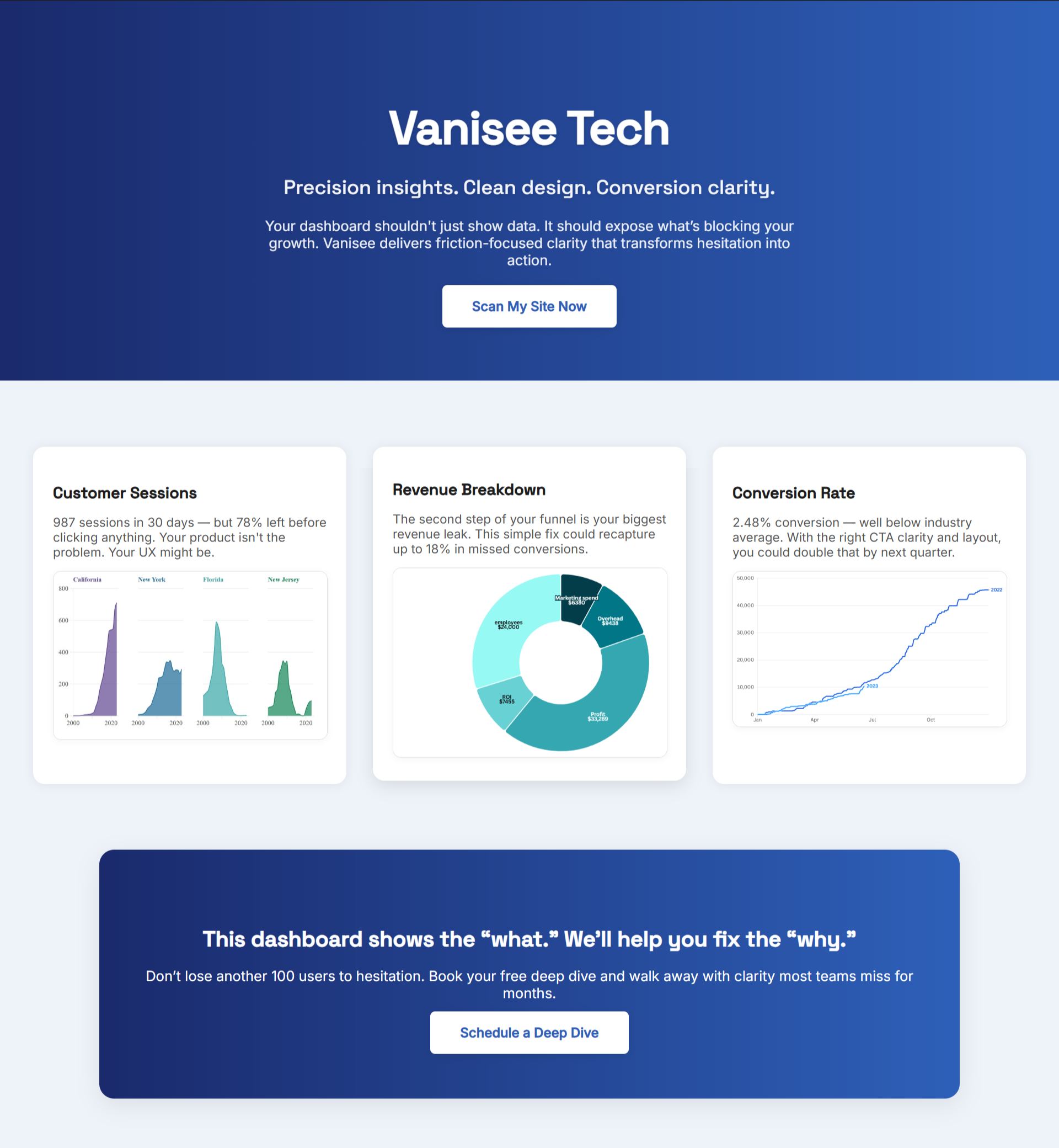
A foggy first screen leaks revenue. If a visitor can’t restate your offer in seconds or find the button with confidence, ad spend turns into bounces and “maybe later.”
Start Where Buyers Decide
Great UX starts on the decision page, not in a redesign deck. Identify the one page where a new visitor should convert next—pricing, a top product, onboarding, or a core service—and make it the priority. Name the outcome in everyday language, not features. The job: get a cold visitor to click once with confidence.
For context on why analysis beats gut feel, the post UX Audit Insights That Outperform Redesigns shows how targeted fixes beat wholesale rebuilds for speed and lift.
Put the Offer in a Line
Your headline should read like a clear promise a human can repeat. If it takes more than one short sentence to explain the win, you’ve hidden the value. Put the verb first. Cut adjectives. Pair the headline with one subhead that names who it’s for and the immediate outcome of the click.
Make the First Click Obvious
If the primary CTA competes with navigation or secondary links, the eye drifts and doubt rises. Place one visually dominant button within the first scroll. Keep the label specific (“Start Your Scan,” “See Plan & Price,” “Book a Demo”) and place any secondary action as text, not a sibling button.
Put Proof Within Reach of the Button
People don’t look for reassurance; they need to bump into it. Place a tiny trust object within an inch of the primary CTA: a short testimonial, a benchmark, a policy “risk reducer” (setup time, data use, refund). When proof lives close, time-to-click drops.
If you want an evidence-first way to choose which proof to show, UX Audit Frameworks That Turn Estimates Into Measurable Growth explains how to translate observations into page-level priorities you can score and track.
Remove Micro-Friction Before Fancy UI
Design polish can’t fix unseen snags: busy hero images, long paragraphs, or a form that asks for everything. Strip back to structure. Make the eye path linear: promise → proof → action. Push decorative elements below the fold unless they help comprehension. Every extra choice costs a little momentum you can’t buy back.
“The goal is to design for the way people behave, not for how we wish they would.” — Don Norman

Answer the Two Doubts That Kill Clicks
Visitors stall for two reasons: “Is this for me?” and “Will this work here?” Put one sentence for each directly above the CTA. “Built for Shopify stores with 20k–200k monthly sessions.” “Used by teams with no in-house dev.” The tighter the fit, the faster the click.
Keep Objections Beside, Not Below
If you bury objections in an FAQ at the bottom, you’ve delayed a decision. Place a compact objection row next to the button: setup time, integrations, commitments, privacy. Each answer should be seven words or fewer. Long answers belong on a separate, optional link.
Measure Signals That Predict Lift
Stop chasing only conversions. Track page signals you can move today:
- Headline comprehension: A stranger can restate the promise in seven seconds.
- CTA visibility and focus: The primary action is the first control seen after the headline.
- Objection exposure: Top two doubts appear within one screen of the button.
When these three rise together, conversion usually follows. If sessions climb but sales don’t, the problem is hesitation on the page.
Run a Weekly Loop, Not a Quarterly Redesign
Big launches eat quarters. Momentum loves small wins. Use a tight two-step rhythm that repeats every week:
- Build loop (Mon–Tue): Approve copy and states before code. Lock the storyboard: Frame → Action → Proof → Next Step.
- Show loop (Thu): Demo the exact path a buyer takes. Call out what changed in comprehension, CTA visibility, and proof placement. Assign one friction fix for next week.
This loop turns “design” into measurable sales work—lightweight, fast, and defensible.
Bring Proof to the Page in Minutes
You don’t need a month to find lift. Read the key page now. BluePing reads your live screen and shows, in about 30 seconds, where the structure holds and where hesitation creeps in—a quick preview with a few strengths to keep and one clear red-flag to fix. Unlock the full report for $395 and see precisely what’s costing you—policy placement, proof gaps, or a CTA that hides in plain view. It takes under a minute to join, and hundreds of founders are already queued.


