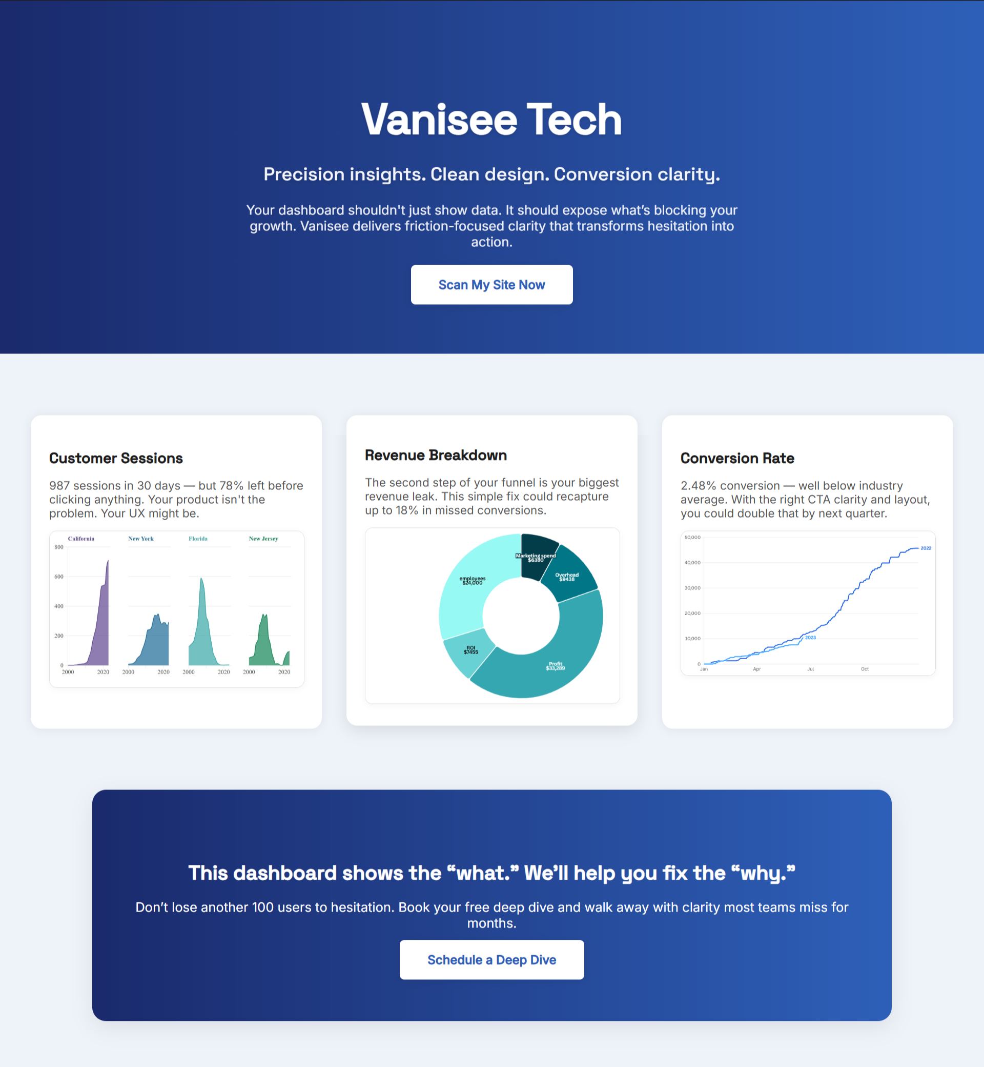
Shoppers don’t read roadmaps, in fact its much different: they react to what they see in the first screen. If your product page can’t make a stranger say “Yes” in seconds, every new visit is overhead. This playbook lifts sales in a week by fixing the places where buyers decide.
“In God we trust; all others must bring data.” — W. Edwards Deming
Work Where Revenue Actually Happens
Scope the week to three surfaces. If a task doesn’t touch one of these, it waits.
- Product page – headline, price, options, returns, and a visible “Buy” button.
- Cart/Checkout – fast pay, minimal fields, no surprise costs.
- Confirmation & first-purchase follow-up – clear next step and an easy reorder path.
For a cautionary tale when teams chase pretty detours, see The Trap of Beautiful but Broken Custom E-commerce Development.
Five-Second Checks You Can Run Today
Run on desktop and mobile. If you fail any, fix before adding content.
- Headline comprehension: Can a first-time visitor restate the offer in ≤7 words?
- CTA visibility: Primary action visible in the first scroll with high contrast.
- Price & risk clarity: Shipping, delivery time, and returns within reach of the button.
- Micro-proof: Rating, testimonial, or guarantee one screen from the CTA.
- Choice sanity: No forced account; options fit on one screen.
When teams skip these and chase templates, growth stalls—why those delays compound is in Why Custom E-commerce Development Delays Quietly Kill Momentum.
One-Week Sprint That Raises Sales
A loop you can repeat every week:
Day 1 — Define the win.
Write the first-screen story: headline → image → CTA → proof. One sentence for this week’s outcome (e.g., “Lift product-page ‘Add to Cart’ by 15%”).
Day 2–3 — Ship the first pass.
Trim copy to plain English; place price, delivery, and returns beside the CTA; add one credible proof element (verified review, short testimonial, or guarantee stamp).
Day 4 — Measure.
Track the signals below. Screenshot changes.
Day 5 — Decide.
If comprehension and CTA clicks rise, keep it and iterate. If not, revert and try the next idea. No redesign detours.
.png)
Signals That Predict Sales
- Comprehension rate: % who can state the offer after a 5-second view.
- Primary-CTA visibility: % of sessions where the CTA appears in the first screen.
- Click-to-proof: % who interact with a review/guarantee near the CTA.
- Checkout completion: Starts vs. finishes by device and source.
Dashboards won’t rescue a confusing page. Common failure modes show up in The False Security of Custom E-commerce Development.
Fast Fixes You Can Ship in Minutes
- Make the CTA a solid, single color with a short verb (“Buy now”).
- Put final price, delivery date, and return window within one screen of the button.
- Collapse long option lists; default to the most popular variant.
- Enable express pay and remove forced account creation.
- Replace a carousel with one clear product image and zoom.
- Swap “Learn more” for a direct action (“Add to Cart”).
- Add a tiny proof row (⭐ 4.8/5 from 1,243 reviews) beside the CTA.
Objection Busters (Copy-Paste)
Short fragments that work near the button: “Free 30-day returns.” “Ships tomorrow.” “Secure checkout.” “1-year warranty.”
Why BluePing Helps You Win Faster
You don’t need a quarter to learn if these fixes worked, it's page-level truth that's necessary. BluePing reads a live product page in ~30 seconds and shows a preview with 2–3 strengths and one visible red-flag to fix. The deeper list unlocks in the full report and stays private to your team. Scan your highest-traffic page now. Join the waitlist and get early access; the preview locks after 10 minutes to protect your data.

.png)


.png)