Something isn't right in your customers journey, and thats probably how things have been looking on the backend lately. Too many Ecommerce businesses fall to the common mistakes that are sen countless times nowadays on their websites. With this in mind, it may be time to ask yourself: Do they quit because the path to the right product isn’t obvious? Category and search pages decide if a visit becomes a cart. Clean those surfaces and revenue climbs without touching ad spend.
“What gets measured gets managed.” — Peter Drucker
Treat The Category Page Like A Decision Page
If a stranger can’t scan, narrow, and spot a fit in seconds, the back button wins. Start by naming the job of the page: “Help a new visitor choose the right product from 50 options.” That lens makes choices simple: everything above the first row supports scanning and narrowing; anything else is noise.
Make The First Screen Do Real Work
The first view should answer three questions: where am I, how do I narrow, what looks promising. Use a clear title, a compact filter bar, and a focused grid. Avoid tall banners that push products down, so lead with items, not decoration. If your product pages already follow the discipline in Win the First Screen to Increase Ecommerce Sales, bring the same clarity here.
.png)
Tune Filters For Fast, Confident Narrowing
Filters fail when they’re long, cryptic, or hidden. Keep the set short and specific: the attributes buyers actually use. Show active chips at the top so deselecting is painless. Default to a sensible sort (popularity or relevance) instead of burying the best sellers. And keep the filter drawer predictable on mobile—full-height, big targets, one clear “Apply.”
Design Cards For Comparison and Remove Mystery
A product card should help a human choose—at a glance. Show price, key variant or size availability, and one short cue that answers doubt (e.g., “Free returns,” “2-day delivery”). Use consistent image framing so eyes compare like with like. If you show badges, limit to one meaningful proof, because too many looks like ads. Quick-add can help, but only when options are simple; otherwise the card should invite a confident tap into the detail page. If you want the pattern for placing short, verifiable proof beside primary actions, see Ship With Proof, Not Promises.
Prevent Dead Ends In Search And Pagination
Zero results and deep pagination drain intent. Offer helpful fallbacks when a search is empty: popular queries, top categories, or a quick “broaden your filters” prompt. On long lists, use “Load more” with clear progress rather than tiny numbered pagination, because momentum matters on mobile. The goal is forward motion with minimal effort.
Instrument What Predicts Orders
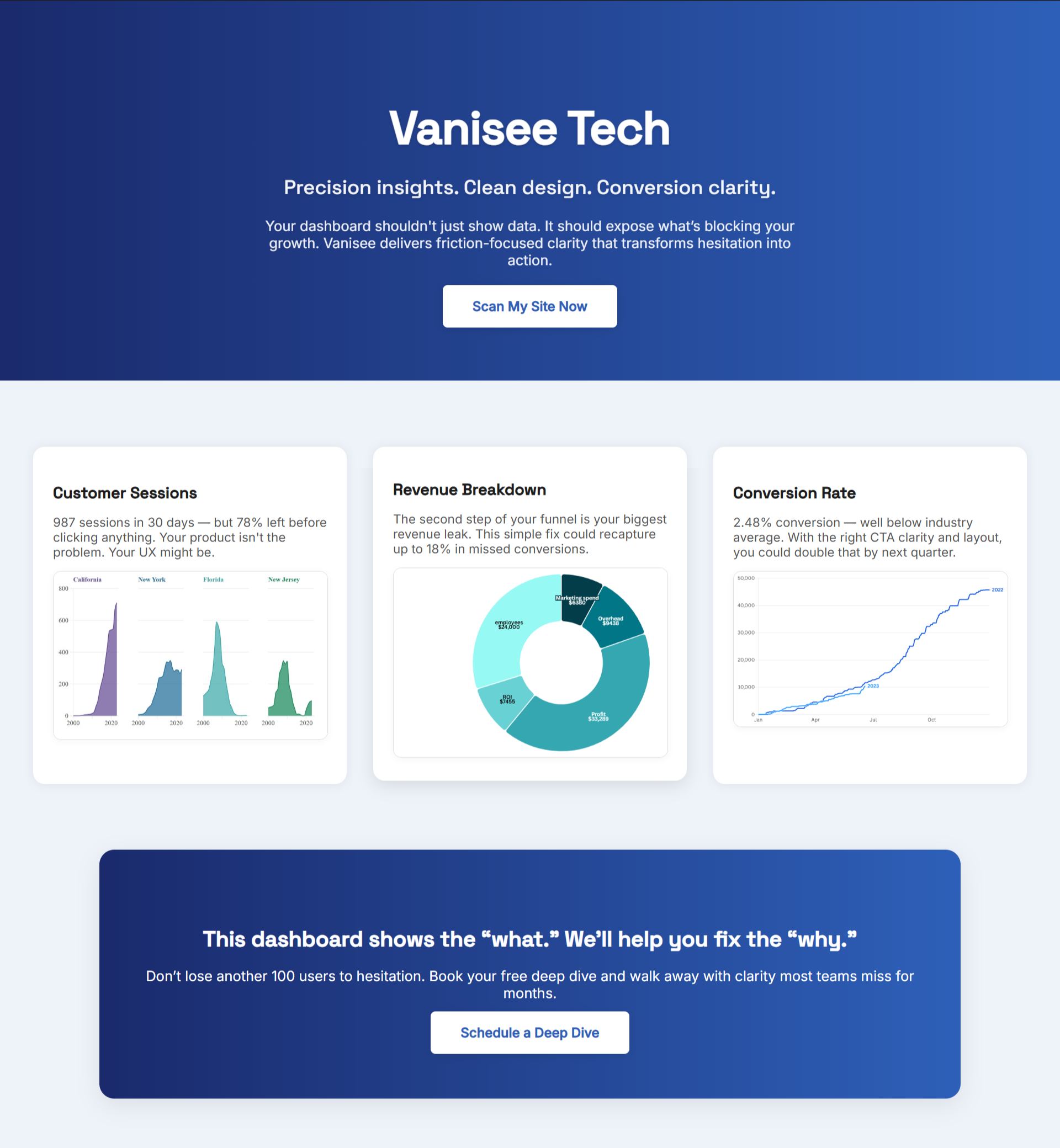
Dashboards won’t rescue a page that’s hard to use. Track signals you can move this week: filter use and removal rate, time to first product tap, card-to-detail click-through, and add-to-cart starts per 100 grid views. When those improve together, orders usually follow without touching channels.
Ship Small Edits Weekly—Then Lock The Wins
You don’t need a redesign. For a simple weekly cadence that keeps these changes shipping, borrow the two-loop sprint from Set The Rhythm That Ships Revenue.Swap the banner for a title, pin the top three filters, simplify card info, raise contrast on prices and buttons. Review mobile first; that’s where fatigue is highest. Keep a short changelog with screenshots so the wins stick as your catalog changes.
Why BluePing Helps You See The Gaps Faster
Category pages hide friction your analytics won’t spell out—cluttered first screens, filters that bury the good options, cards that don’t answer doubts. BluePing reads a live page in ~30 seconds and shows a preview with 2–3 strengths and one visible red-flag to fix private to your team. The full report unlocks the deeper list and keeps findings tied to the exact surface.
Stop the leak before next week. Scan your highest-traffic page now. Your preview locks in after 10 minutes to protect your data. Unlock the full report for $395 and fix what’s costing you — it takes under a minute to join, and hundreds of founders are already queued for early access.


.png)
