Start Where Buyers Decide
Great tech won’t carry a foggy page. Buyers commit when they can retell your promise quickly, see one next step, and feel safe taking it. That means your pricing, onboarding, or core service page—not a dashboard—deserves first priority. Name the single decision you want a new visitor to make and draft the headline that states the outcome in everyday language.
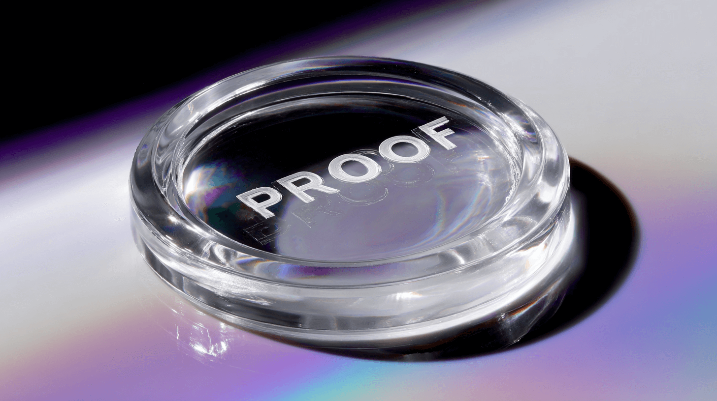
Put Proof Within Reach Of The Button
Proof works best when it trims hesitation right before the click. Place a short testimonial or benchmark within one screen of the primary CTA, then add a single risk reducer (setup time, data use, or refund policy). Keep it compact and close. If the layout forces people to hunt for reassurance, they’ll open a new tab instead of your product.
“Proof is a speed feature when it lives near the decision.”

Tighten The Demo Around One Page
Demos are often impressive yet unfocused. Anchor them to the exact page you’re improving this week. Show the first screen, say the seven-word offer out loud, click the CTA, and pause on the proof element. End by answering the two objections you wrote beside the button. Practiced this way, the demo becomes a rehearsal for a real buyer journey and your agency’s work becomes obviously tied to revenue.
Use Micro-Experiments To Build Confidence Fast
Swap sprawling experiments for small, time-boxed changes: a clearer headline, a stronger verb on the button, or a trust badge placed closer to the action. Measure comprehension, CTA visibility, and clicks by source over a handful of days, not months. This format makes results defensible and keeps scope from ballooning.
For a quick reality check on partner fit, the questions in How to Evaluate an MVP Development Company Before You Sign the Contract reveal whether a team can execute this page-first approach. If your progress feels busy but not directional, compare your sprint goals with the alignment cues from The Hidden Risk of MVP Development Company Misalignment With Your Stage. And when traction fades after release, the patterns in MVP Development Company Shortcuts That Cost More Than They Save explain why “fast” sometimes turns into rework.
Stop the leak before next week. Scan your highest-traffic page now. Your preview locks in after 10 minutes to protect your data. Unlock the full report for $395 and fix what’s costing you — it takes under a minute to join, and hundreds of founders are already queued for early access.

.png)