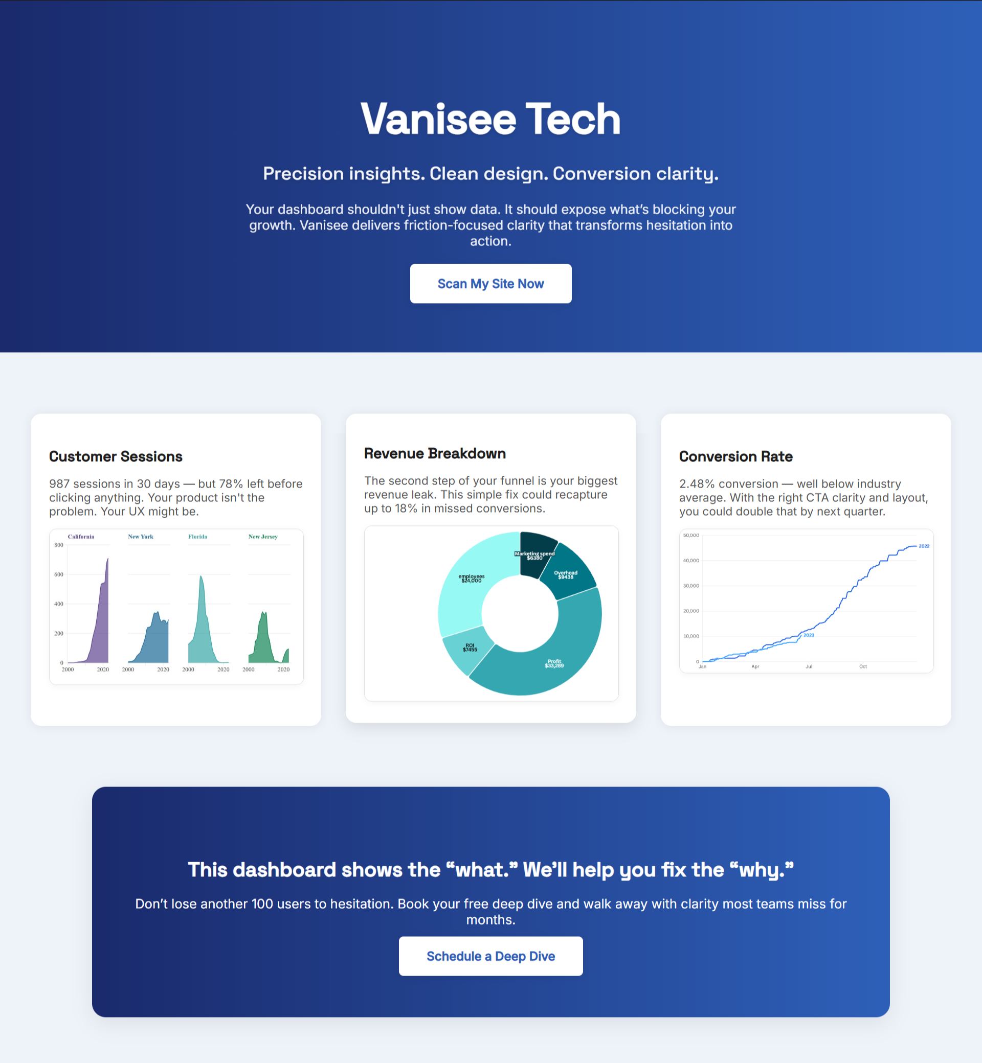
B2B buyers don’t “explore.” They skim for fit, safety, and next step—then they bail. If your first screen reads like a brochure or hides the action, pipeline slows while competitors collect the easy wins.
Define the One-Screen Win
Pick the one action that advances a cold visitor today: start a trial, book a discovery call, view plan and price, or launch a guided demo. Write it first. Then design the page backward from that click. Every word and pixel should earn either comprehension or confidence for that action.
Say the Promise in Plain Language
Enterprise jargon turns clear offers into riddles. Rewrite the headline so a busy PM can repeat it out loud. Follow with a subhead that names the buyer and the immediate result. Cap the subhead at two short clauses. If you need three, you’re stuffing in positioning that belongs below.
For proof that focused messaging outperforms fancy redesigns, see UX Audit Services That Find Friction Before It Costs You Revenue—it shows how tiny structural fixes beat sweeping UI projects.
Put the Button in the Line of Sight
The first action should be the first visible control after the headline. Don’t let nav bars, banners, or form fields fight it. Prefer a single high-contrast button. Label it with an outcome (“See Plans,” “Get Pricing,” “Book Strategy Call”) rather than a process (“Learn More”).
Show Social Proof Where Doubt Lives
B2B risk is social. Place one compact testimonial or metric directly beside the button. Keep it specific: role + outcome + time. “Ops lead: setup in 3 hours, shipping next day.” If you have a benchmark or a security badge that answers a common fear, stack it under the quote—tight and close.
Clarify the Path After the Click
Buyers hesitate when “what happens next” is fuzzy. Write a tiny next-step line under the CTA: “Takes 2 minutes. No credit card.” or “We’ll show a live dashboard, then share pricing.” The goal is to replace guesswork with a short, safe preview of the next screen.
“The details are not the details. They make the design.” — Charles Eames

Triage Objections in the Margin
Move top objections beside the primary action, not into a deep FAQ. A simple two-column row works: “Data use,” “Integrations,” “Cancellation,” “Support.” Each answer should fit in a short phrase. Link the deep dive only for buyers who need it.
Use Page-Level Signals, Not Vanity Metrics
B2B teams often celebrate traffic and session time while leaks fester. Track three signals you can move weekly:
- Time to promise: Can a new visitor restate the offer within seven seconds?
- Click visibility: Is the first meaningful click within one screen of the headline?
- Doubt coverage: Are the top two objections answered next to the CTA?
When these signals rise, qualified clicks rise. If they don’t, you’re polishing the wrong parts.
For more on finding and fixing the real blockers, UX Audit Mistakes Responsible For Your Revenue Drains breaks down the patterns that quietly stall growth.
Ship in Small, Reversible Steps
Enterprise pages get safer when changes are reversible. Split the hero into two experiments: message clarity pass (headline, subhead, CTA label), then proof placement pass (testimonial + risk reducer near the button). Review the page with sales before pushing live to ensure the promise mirrors how reps actually sell.
A Weekly Show-and-Tell That Moves Pipeline
Replace committee redesigns with a rhythm the whole team can rally around:
- Monday storyboard: Promise → proof → action → next step. Approve states before code.
- Thursday demo: Walk through the exact click path a buyer takes. Note comprehension, CTA visibility, and where eyes seek reassurance. Assign one fix for next week.
This loop creates defensible wins. Every week, one less reason to stall.
Bring the Evidence to Your Page Fast
You can test the above today. Read your decision page now. BluePing scans the live screen and returns, in about 30 seconds, a preview that spots strength (what to keep) and one red-flag that stalls clicks. Unlock the full report for $395 and you’ll see a prioritized list of friction issues mapped to where buyers hesitate. Join in under a minute; hundreds of teams are already queued.


.png)