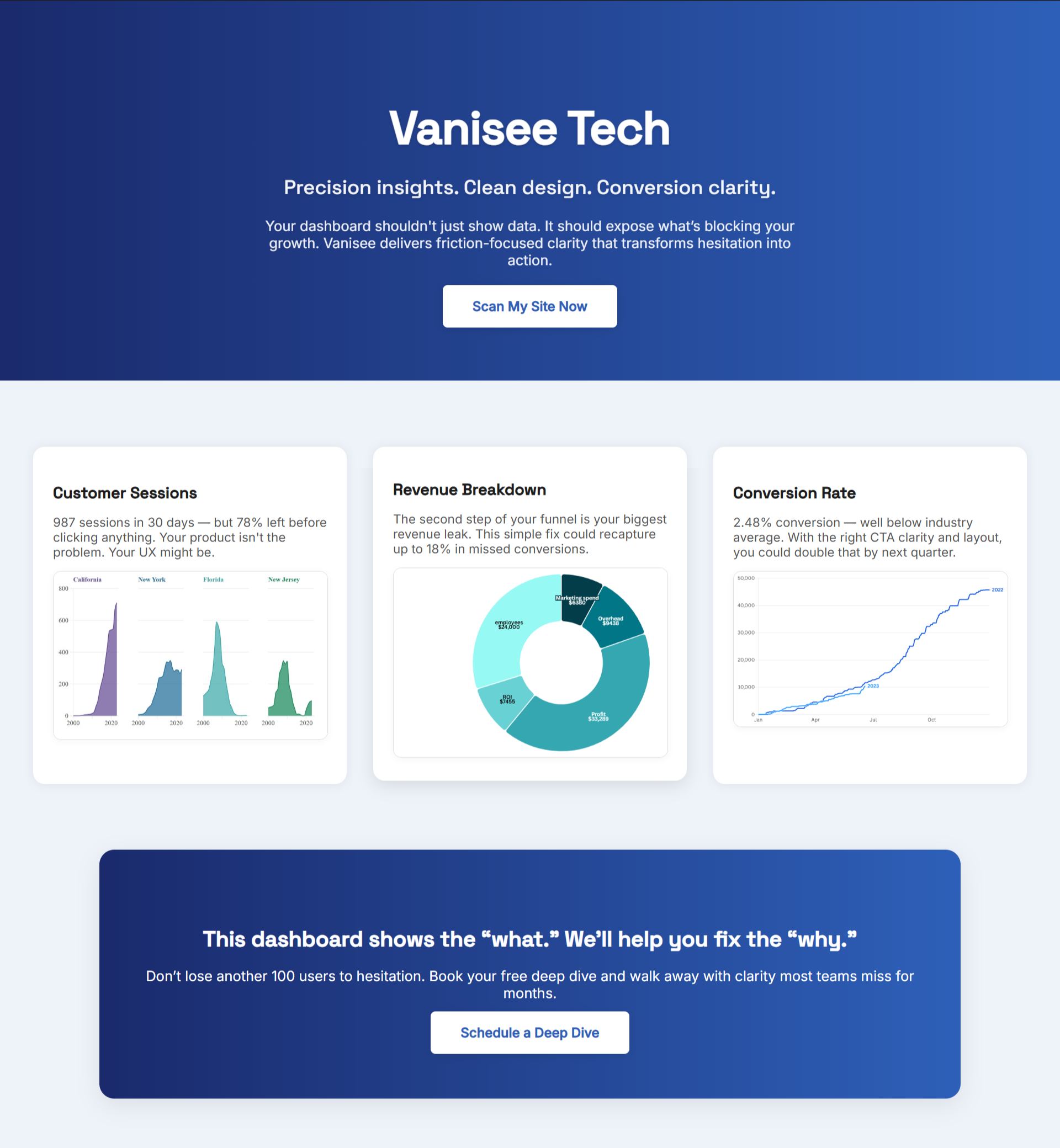
You spent time and money getting your WordPress homepage design to look great. Clean layout, smooth scrolling, maybe even a little animation to show polish. But if conversions are flat, it was never the design. it’s the clarity. Visitors are landing on your site and still asking the most dangerous question a user can ask: “What am I supposed to do here?”
Truthfully, visual polish without directional clarity is just decoration. If your WordPress website design isn’t built around message hierarchy, the invisible order that guides the eye and brain through your offer. People leave. Fast.
What Most WordPress Sites Get Wrong
The average WordPress homepage commits three silent crimes:
- No clear headline that tells me what you do
- Competing sections fighting for attention
- No visual priority given to the one action you want people to take
Even premium themes or expensive designers fall into this trap. In fact, many WordPress sites fail because they over-design. They're making everything look important, which means nothing stands out. If this is sounding familiar, your site might be suffering from what we called the “overbuilt UX trap” in this breakdown "The Hidden Costs of Affordable WordPress Website Design Customization".
Why Hierarchy Beats Aesthetics
Visitors don’t convert when they’re impressed. They convert when they’re clear. That means your headline should make a promise or create intrigue immediately. Your subtext should support that promise. Your CTA should be unmistakable and feel like the natural next step, not a side option.
If your WordPress website design looks clean but people still bounce, it’s often a hierarchy problem in disguise. For example, are your CTA buttons consistent? Is your value proposition at the top or buried under a stock image? These are silent killers we unpacked further in this blog about design sabotage called "Affordable WordPress Website Design That Actually Converts".
.png)
The Real Problem Isn’t the Platform
It’s easy to blame WordPress. Too many plugins. Clunky themes. Endless updates. But the platform isn’t the problem — the strategy is. Most WordPress users choose templates based on looks, not flow. But clarity is engineered, not inherited.
It’s not about finding the “right” theme. It’s about controlling what people see first, second, and last. It’s about using size, spacing, contrast, and copy to tell a story without saying a word. Even when your site is technically sound, a lack of hierarchy can silently kill conversions. We explored this idea more in "The Overlooked Cost of Affordable WordPress Website Design (and How to Avoid It)". All these variables contribute to a business's online presence that will lead to its downfall or success, because without a memorable message, traffic just disappears.
What You Can Do Right Now
It might not be too late for you to do the following:
- Revisit your homepage above the fold. Does it say what you do, who it’s for, and why it matters?
- Check for competing elements. Are you asking people to do too much?
- Simplify your calls-to-action. Stick to one main CTA and support it with logical next steps.
- Use visual contrast intentionally. Make the most important section pop — don’t let it blend in.
- Read your site like a stranger. Within 5 seconds, do you know what’s being offered and why?
Clarity Is Conversion
Your WordPress website design should do one thing above all: make people feel like they’re in the right place. That doesn’t come from fancy fonts or clever animations. It comes from structure. Priority. Message hierarchy. When you control the flow of attention, you earn the right to sell.
If your site isn’t converting, don’t rebuild it from scratch. Rethink the story it’s telling.
The time is now to reveal what your sites been missing with BluePing's free first scan.
And if you’re unsure where people are getting lost, BluePing scans your homepage and reveals exactly where your hierarchy breaks down. It’s fast, it’s sharp, and it could be the difference between another bounce and a new customer.
This is the part most WordPress sites miss. Don’t let yours be one of them.
Click here to be one of the first to try BluePing, the strategic clarity your conversions have been missing.

.png)


.png)
.png)