.png)
If you want to increase e-commerce sales, stop chasing redesigns. Start reading signals (what buyers do right before they leave) and making decisions (what you change in response).
This playbook shows you exactly how to do that across the three screens where orders are won or lost:
- Cart
- Shipping
- Payment
If you want the bigger weekly cadence behind this, start here: “Make Your Store Sell Itself: A One-Week Playbook to Increase Ecommerce Sales” (/post/increase-ecommerce-sales-playbook).
The Checkout Leak Map
You don’t need 47 metrics. You need a map:
The only three numbers that matter first
- Cart → Shipping start rate (people who begin checkout)
- Shipping → Payment continuation (people who push through the form)
- Payment → Purchase completion (people who finish when money is on the line)
When one step drops hard, that step is where the page stopped answering questions.
Step 1: Cart Signals and Decisions
Signal A: Shoppers add to cart, then stall
What it usually means: uncertainty after desire (shipping, returns, delivery date, “is this legit?”)
Decision: move answers closer to the next click.
Do this:
- Put delivery window and return policy in the cart view (not buried in a footer)
- Add a single line of micro-proof near the checkout button (rating count, guarantee, “X orders shipped”)
- Remove distractions that compete with checkout (upsells that feel like ads, coupon chaos)
If your first screen is cluttered, fix that too—because the same “decision clarity” rule applies: "Win the First Screen to Increase Ecommerce Sales".
Signal B: Coupon field causes exits
What it usually means: “Am I paying more than everyone else?”
Decision: reduce the threat without creating a discount culture.
Do this:
- Collapse the coupon entry (don’t spotlight it)
- Add a calm line: “Discounts apply automatically at checkout when available.”
- If you run promos, show the promo in-cart so people don’t go hunting
Step 2: Shipping Signals and Decisions
Shipping is where motivated buyers turn into tired buyers.
Signal C: People start shipping, then quit mid-form
What it usually means: form friction + uncertainty stacked together
Decision: make shipping feel fast and predictable.
Do this:
- Reduce fields to the minimum (and keep layout clean on mobile)
- Use one-column inputs and obvious error messages
- Keep the order summary visible so shoppers don’t feel lost
- Make the shipping promise consistent with what they saw earlier (no surprise)
Signal D: Shipping option choice paralysis
What it usually means: too many choices, unclear tradeoffs
Decision: pick a default that matches buyer intent.
Do this:
- Default to the most common option
- Label options in plain language: “Free (3–5 days)” vs “Express (1–2 days)”
- Avoid “mystery labels” that force thinking
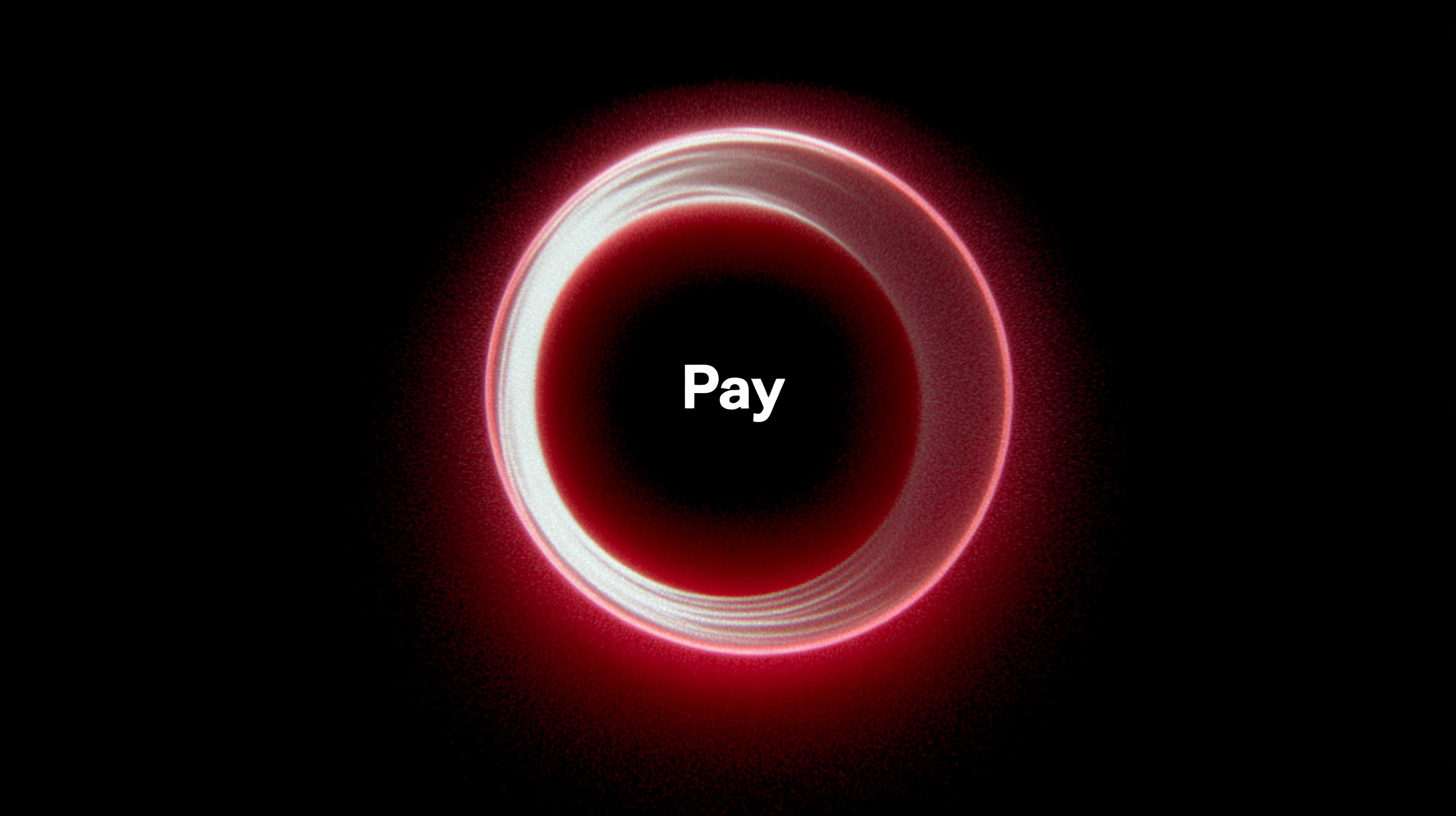
Step 3: Payment Signals and Decisions
Payment is not a button. It’s a trust test.
Signal E: People reach payment, then bounce
What it usually means: trust gap at the exact moment of commitment
Decision: make “Pay” feel safe right next to the button.
Do this:
- Put one guarantee line in the button zone (not below the fold)
- Remove anything that feels like risk: surprise fees, unclear returns, “final sale” ambiguity
- Cut visual clutter (extra offers, surveys, popups, competing CTAs)
Signal F: Payment errors spike
What it usually means: UX breakage, not persuasion. Especially on mobile.
Decision: treat it like a mechanical failure.
Do this:
- Test checkout like a shopper (device, browser, speed)
- Verify the most common payment path is the simplest path
- Remove optional steps that interrupt completion
The “Answers Near the Button” Rule
Here’s the fastest way to recover revenue:
Every checkout step should answer 3 questions within one screen of the primary button:
- When will I get it?
- What if I don’t like it?
- Is this safe / legit?
If you want to apply that rule outside checkout too, read: “Turn Doubts Into Orders: Increase Ecommerce Sales With On-Page Answers”.
A Weekly Loop That Compounds
Don’t redesign. Don’t boil the ocean.
Run this loop every week:
- Pick one step (Cart, Shipping, Payment) that leaks most
- Identify the top signal (stall, exits, errors, confusion)
- Make one decision (one change that answers one question)
- Track the 3 numbers again
- Keep what wins, delete what doesn’t
And if your category pages are the real bottleneck (shoppers can’t find the right product fast), this matters more than checkout polish:
“Category Pages That Convert: How To Increase Ecommerce Sales Without a Redesign”.
Why BluePing Helps You Find the Leak Faster
You can do this manually. It just takes time.
BluePing compresses the first pass by scanning a page and surfacing:
- 2–3 strengths that are already working
- one visible red-flag issue
- deeper friction points that explain why shoppers hesitate
Scan your highest-traffic page first—then apply this signal-based loop to the step that’s leaking.